

Bold brands for heart-centered creatives
who want to joyfully disrupt the status quo
It’s time you had sharp strategy and tattoo-worthy visuals that scare away the price-shoppers, position you as THE industry expert, and start your legacy.
Click on any of the projects below to view the case study.
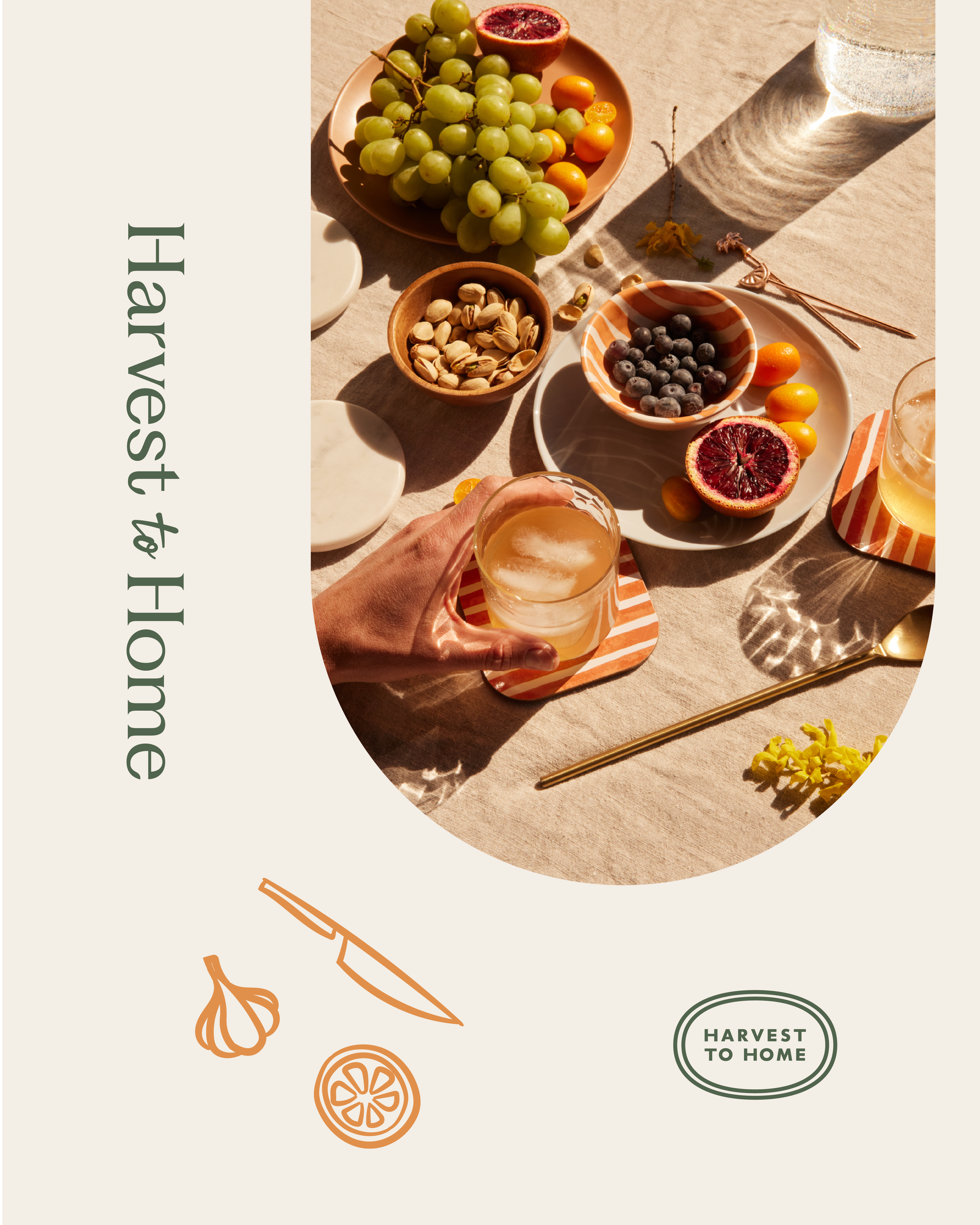
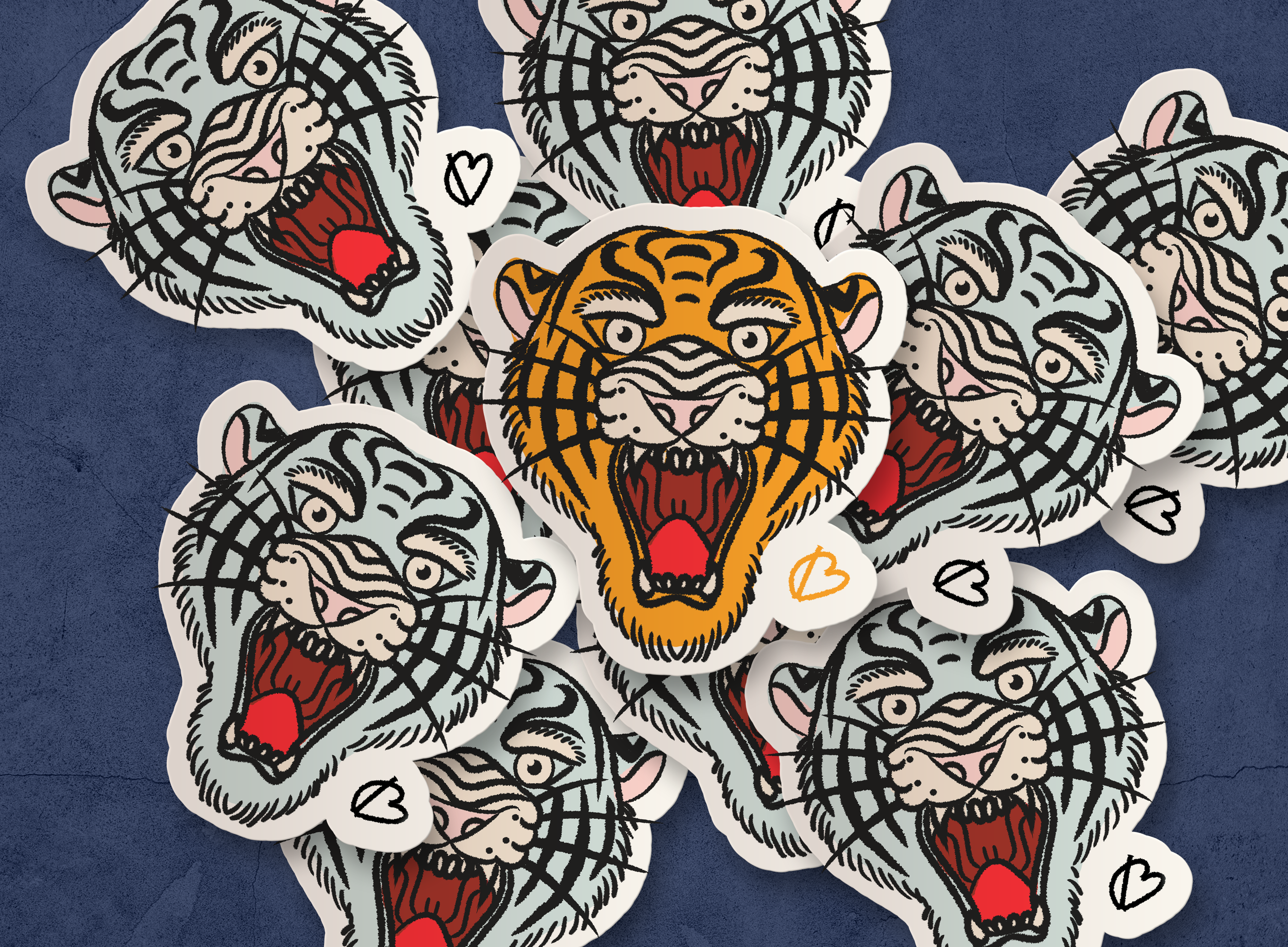
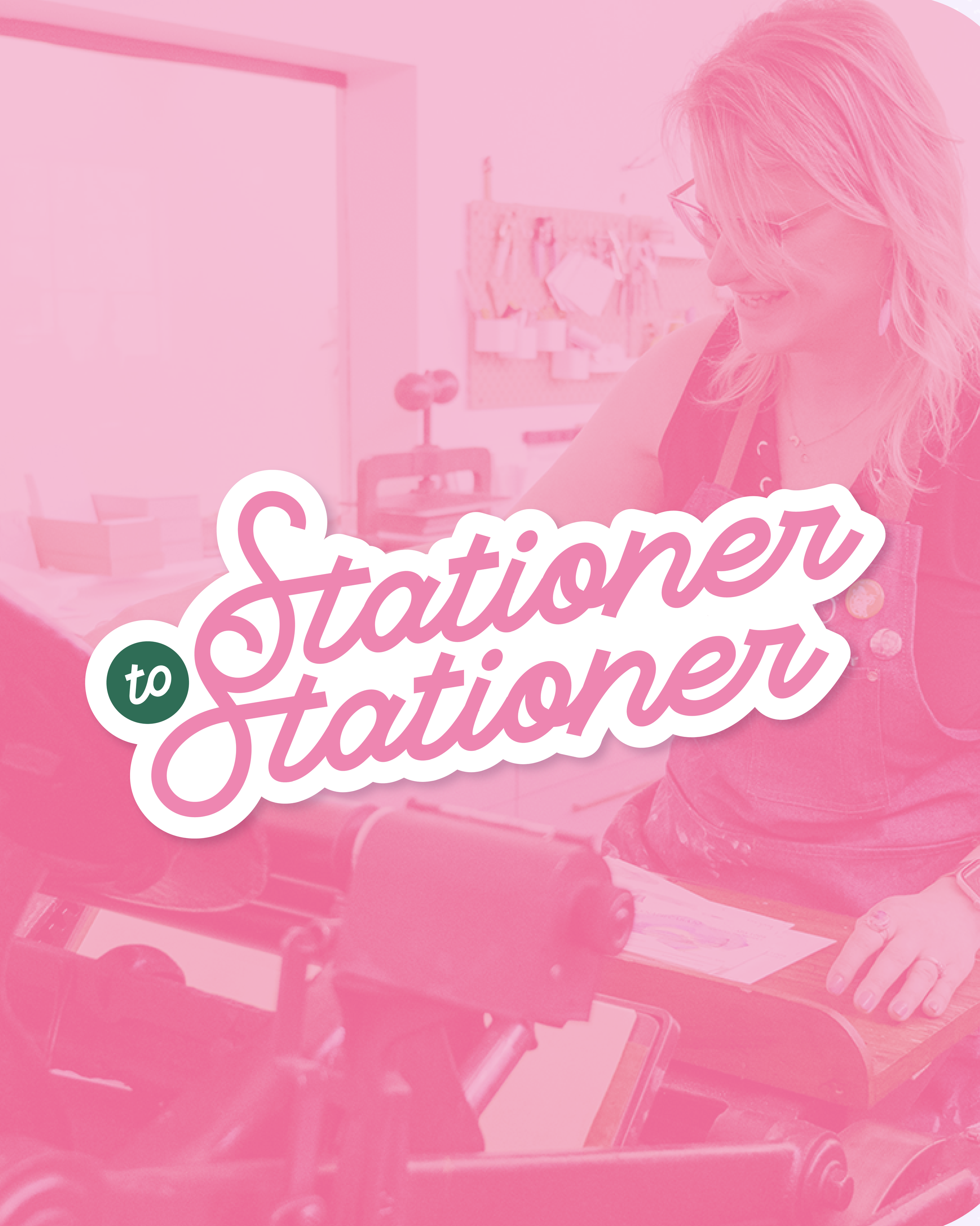
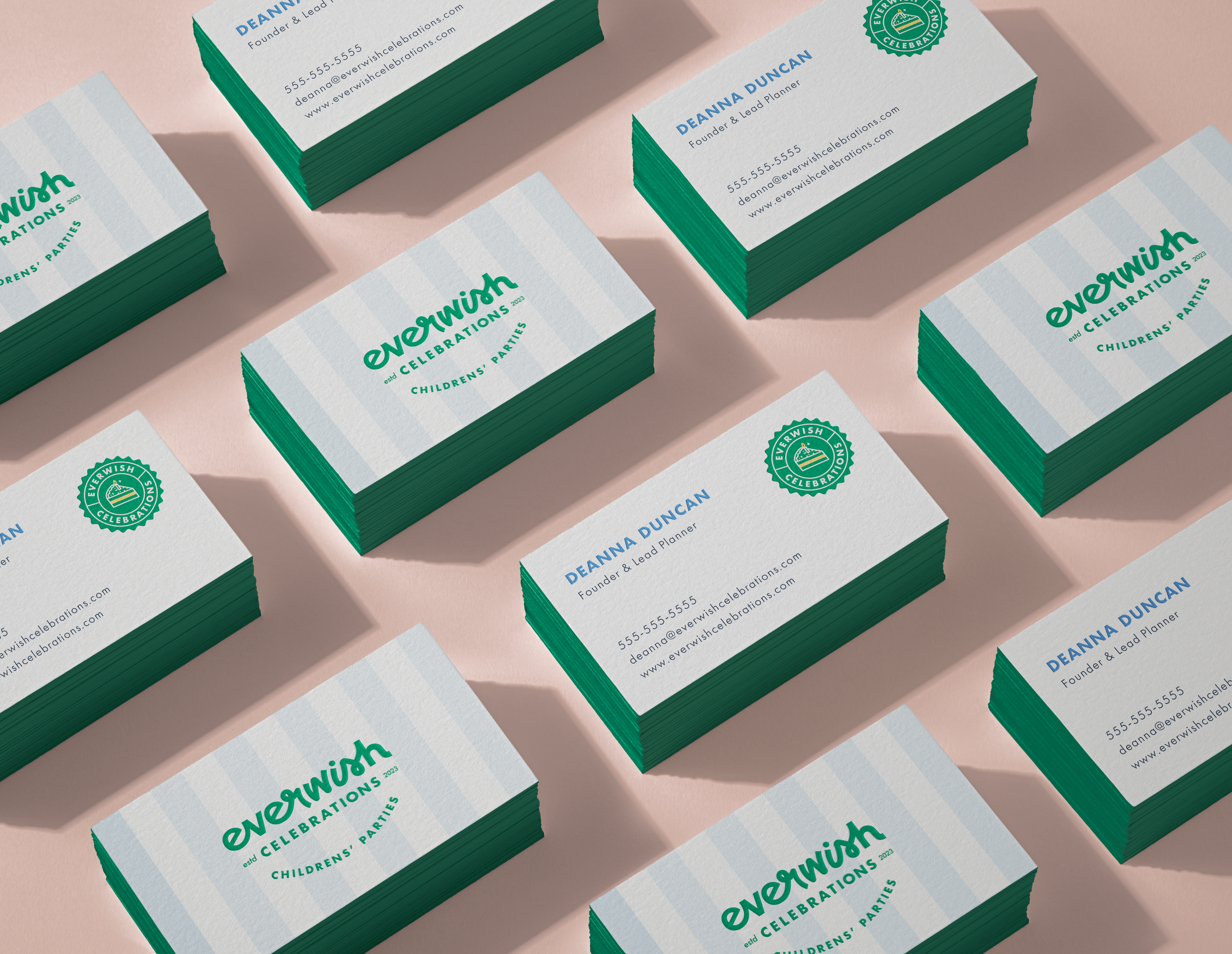
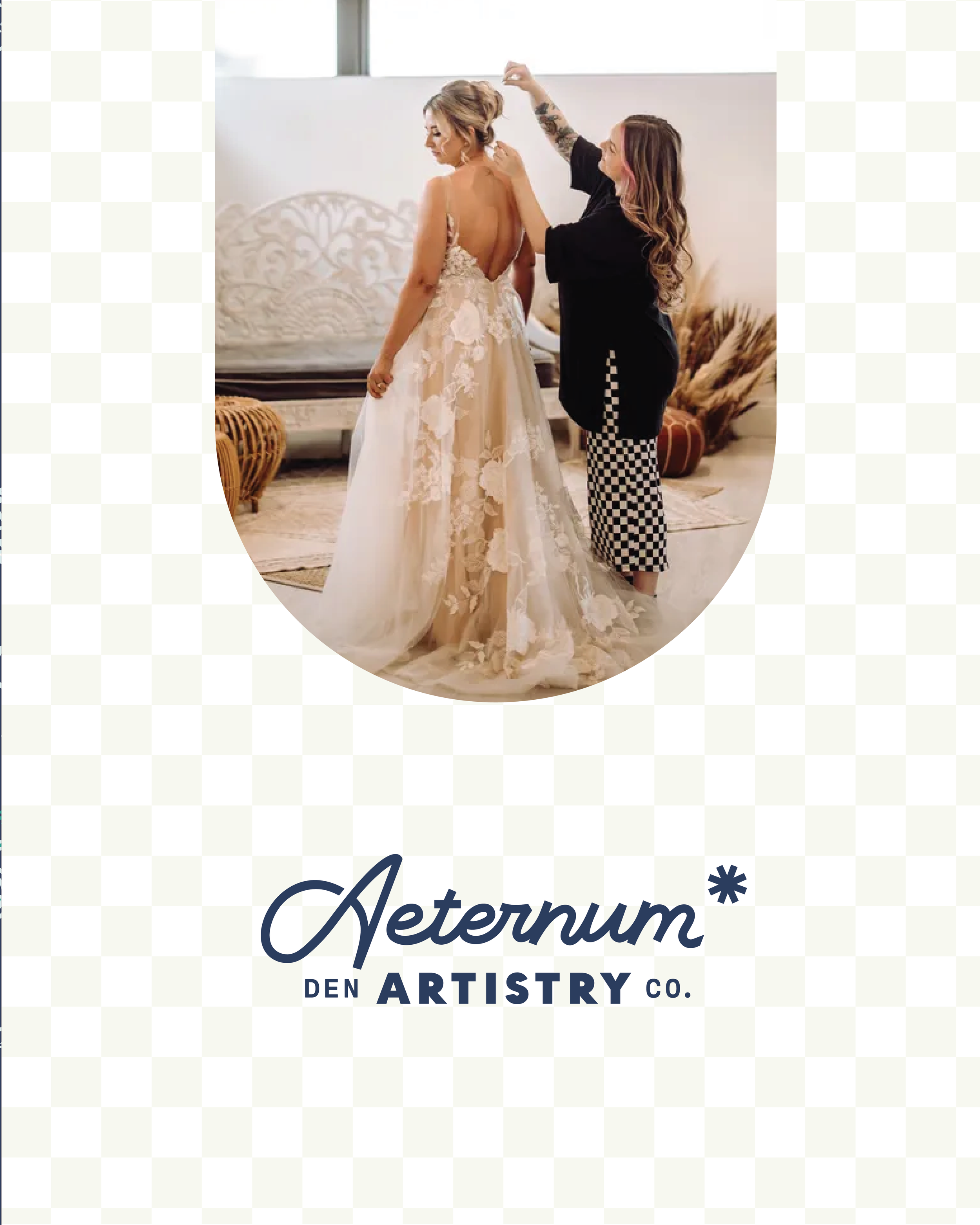
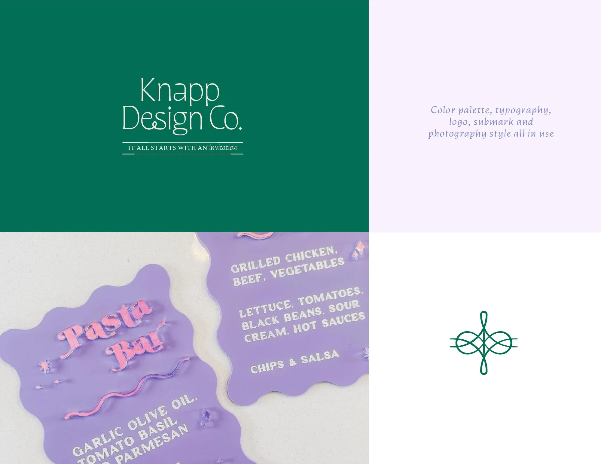
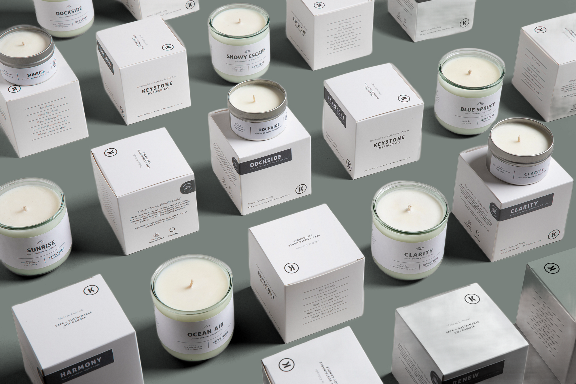
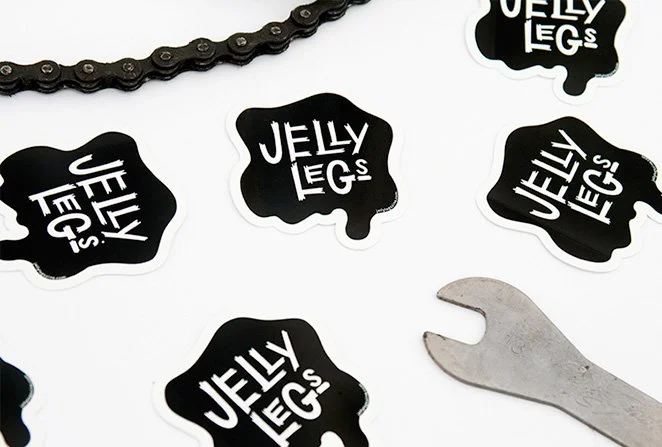
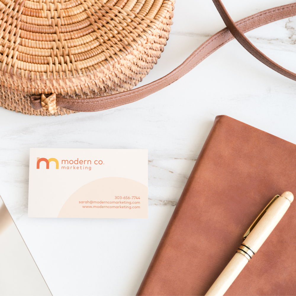
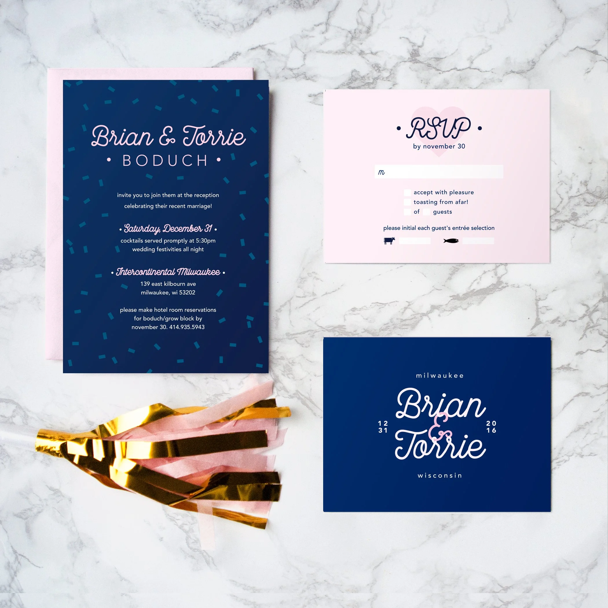
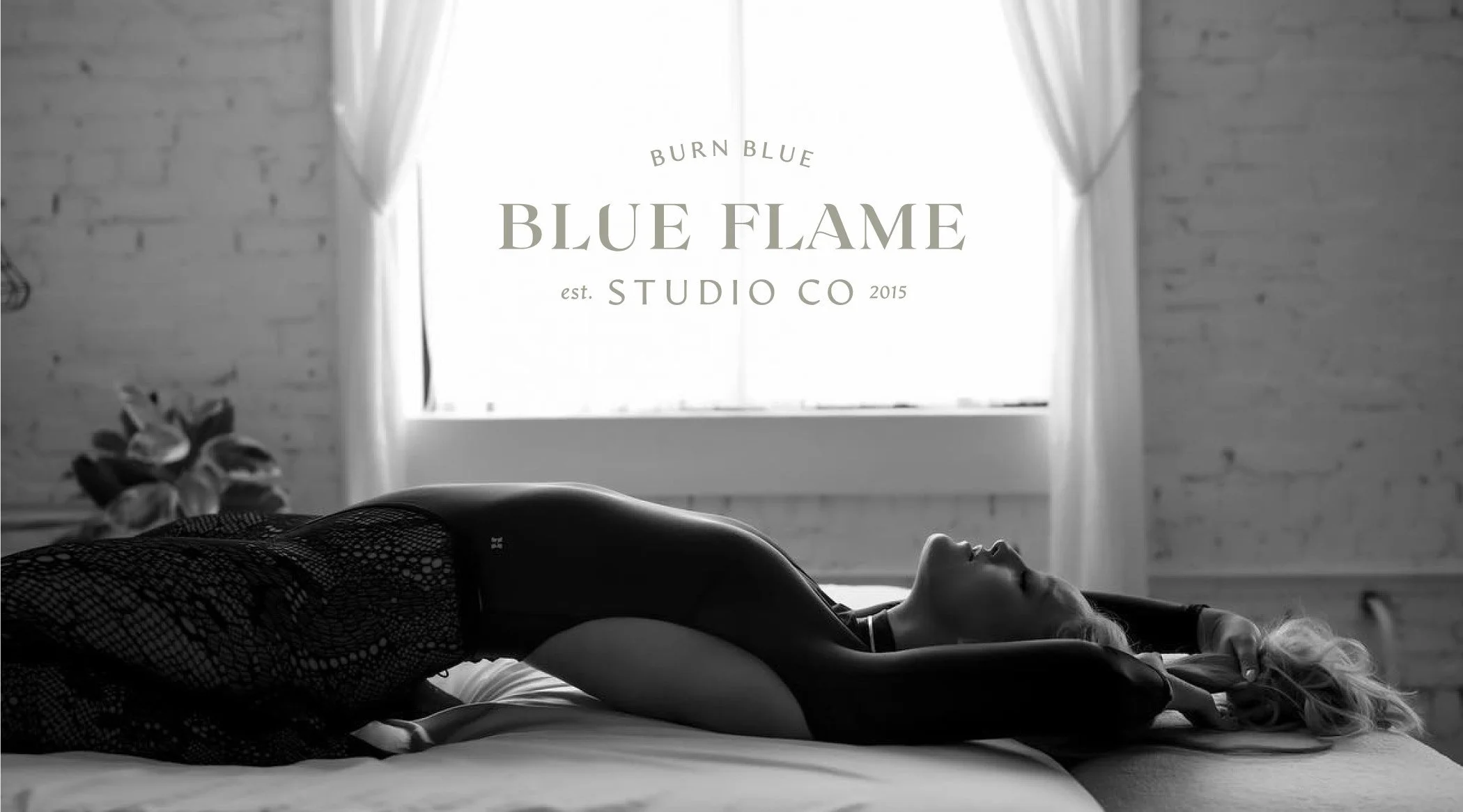
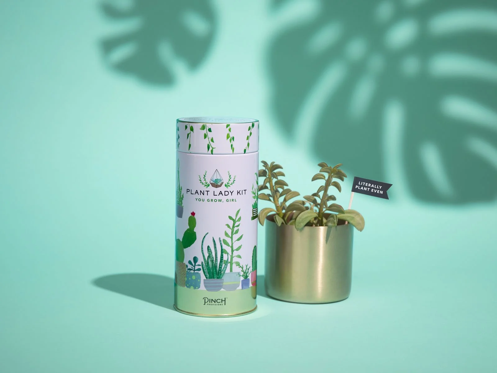
Brand Design Portfolio:


More from over the years…


BTW, I believe that inclusivity is the bare minimum.
If you don’t believe in human rights for all, you can go kick rocks. Full stop. Your brand should reflect your values in ways that are clear, embodied, and leave loaf-sized breadcrumbs for the people who get it.

You can be colorful and still be high caliber
High-end does NOT have to mean beige, muted, or boring. If someone told you that bold can’t be taken seriously, that’s whack ass advice. You can be vibrant, disruptive, expressive — and still command premium rates.
Playing it safe is suffocating.
Being subtle to make other people comfortable? Hard pass. Be your whole ass self, please. I’m begging you. The right clients aren’t scared of personality — they’re actively looking for it.
Brand designers shouldn’t have a “style.”
If the work looks like me instead of you, I’ve failed. Strategy comes first. Your brand should be built around what makes you the easiest, obvious hire — not my personal aesthetic preferences.